How to Mix Patterns in Home Decor Without Creating Visual Chaos
Affiliate Disclosure: DecorDesignIdeas.com is a participant in the Amazon Services LLC Associates Program, an affiliate advertising program designed to provide a means for sites to earn advertising fees by advertising and linking to Amazon.com.
As an Amazon Associate, we earn from qualifying purchases. This comes at no extra cost to you.
Pattern mixing separates rooms that feel pulled-together from rooms that feel flat. An all-solid room is safe but boring. A room with clashing patterns is interesting but exhausting. The sweet spot is a room where multiple patterns coexist in a way that feels confident rather than accidental.
DecorDesignIdeas Editorial treats the mix as three-scale first. We compare The Spruce’s pillow note (one lead pattern with all the colors, then a medium, then a texture), Kit Kemp’s Homes & Gardens scale tip (different scales so prints can breathe), and the leftover after you can name the large, medium, and small. This desk does not stage hotels, and we do not cite a fake ASID “always three patterns” survey.
The good news: pattern mixing follows rules. Not rigid, never-break-them rules, but reliable guidelines that work across styles, budgets, and rooms. Once you understand the framework, you can mix bold florals with geometric prints and stripes without the result looking like a collage gone wrong.
A pale, low-pattern cousin is Scandinavian interior design. Boho that still has to pass a count is in how to blend boho and minimalist decor. Warm, low-contrast solids without a print fight are in warm minimalism and edible interiors. Dark walls that swallow a small print are in dark and moody room makeover. Browse the rest of the design guides. How we research sits on the editorial policy. Funding is on how we make money.
Listing check: rug and pillow-cover links below are tagged Amazon product pages we used to confirm those pattern types are still listed. We are not copying Amazon style notes, and scale still has to be judged against your own sofa and floor. Prices on those pages are research snapshots, not a matching-set kit.
Before you buy the third print
Name the scales. Then shop. Do not reverse that.
- Pick the lead pattern on the largest surface. The Spruce’s pillow note wants the lead to carry the color story. A 22-inch pillow cannot rescue a rug you already hate.
- Write the three scales out loud. Large (readable across the room), medium (readable on the sofa), small (reads as texture from the door). Two patterns at the same scale is the fight.
- Share at least one color. Kit Kemp’s pairing note lets scale or color match. Zero shared color is a collage.
- Keep 60 percent of the room solid. Pattern mixing works because of the quiet. A patterned rug plus patterned curtains plus patterned sofa is three leads.
- Test on a cover, not a custom curtain. One washable cover for a week beats a 96-inch panel you cannot return.
When to skip a pattern mix
| Move | Do it when | Skip it when |
|---|---|---|
| Three patterns at three scales | You already have one lead you like | Buying three “coordinating” prints from one bedding set |
| Floral + stripe + texture | The floral and stripe share a color | Two florals at the same scale |
| Patterned rug as the lead | The floor is the biggest empty field | A loud rug plus loud curtains plus a loud sofa |
| Patterned curtains | The rug is quieter | Two large-scale prints facing each other |
| Five patterns in a small room | Never as a starter | Two or three, then stop |
| Matching every print to the wall chip | Coordinate undertone (warm with warm) | Forcing a cool blue floral onto a creamy wall |
A room that should stay almost solid, with texture doing the work, is in warm minimalism and edible interiors.
The three-pattern rule
The simplest framework for mixing patterns uses three distinct types at three different scales:
- One large-scale pattern - the dominant pattern, usually on the biggest surface (a rug, curtains, or an accent chair)
- One medium-scale pattern - a supporting pattern on throw pillows, a table runner, or bedding
- One small-scale pattern - a subtle texture on smaller accents (a dish towel, a lamp shade, or the binding on a throw pillow)
Using three patterns at three scales creates visual rhythm without competition. If two patterns are the same scale, they fight for attention. If they are all different scales, each one occupies its own lane.
Example combination:
- Large-scale floral on curtains
- Medium-scale stripe on throw pillows
- Small-scale dot or mini-geometric on a lumbar pillow
Pattern categories and what pairs with what
Understanding pattern families makes mixing much easier. Most patterns fall into one of these categories:
Organic patterns
Florals, botanicals, animal prints, abstract painterly prints, watercolor motifs. These patterns feature curves, irregular shapes, and natural inspiration.
Geometric patterns
Stripes, checks, plaids, chevrons, diamonds, trellis, Greek key, hexagons. These patterns are structured, repeating, and based on straight lines and angles.
Textural patterns
Herringbone, tweed, linen weave, bouclé, damask. These are subtle, tone-on-tone patterns that add visual interest without strong contrast.
The reliable mixing formula: Pair an organic pattern with a geometric pattern. Add a textural pattern as the third. The contrast between organic curves and geometric structure creates balance that two organics or two geometrics cannot achieve.
| Pattern 1 (large) | Pattern 2 (medium) | Pattern 3 (small) | Why it works |
|---|---|---|---|
| Floral | Stripe | Herringbone texture | Organic + geometric + textural |
| Botanical leaf | Plaid | Linen weave | Organic + geometric + textural |
| Abstract watercolor | Chevron | Bouclé | Organic + geometric + textural |
| Geometric trellis | Painterly abstract | Subtle damask | Geometric + organic + textural |
The color connection rule
Patterns that share at least one color will look cohesive even if the patterns themselves are very different. This is the single most important rule in pattern mixing.
How to apply it:
- Pick your dominant pattern first (the one on the largest surface)
- Identify two or three colors within that pattern
- Choose your second and third patterns so that each one contains at least one color from the dominant pattern
Example: Your curtains have a blue and cream floral. Your throw pillows use a navy and white stripe. Your lumbar pillow has a cream and tan herringbone. The blue appears in both the floral and the stripe. The cream appears in both the floral and the herringbone. The patterns are completely different, but the shared colors tie them together.
For more on building color schemes across a room, check out our guide on how to choose a whole-house color palette.
Scale variation: why it matters
Two patterns at the same scale always compete. A large floral next to a large geometric creates visual confusion because your eye cannot decide which one to look at first. Different scales create hierarchy: the large pattern leads, the medium supports, and the small adds texture.
How to judge scale:
- Large scale: The repeat is bigger than your hand. You can see the full pattern from across the room.
- Medium scale: The repeat is about the size of your palm. You notice it at conversational distance.
- Small scale: The repeat is smaller than a coin. It reads as texture from a few feet away.
When shopping, hold fabrics at arm’s length. If you can barely distinguish the pattern from across the store, it is small scale. If it is readable from the next aisle, it is large scale.
Where to use patterns in each room
Living room
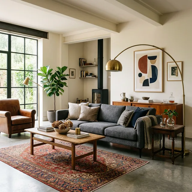
- Rug: Your largest pattern opportunity. A patterned area rug in a Persian, geometric, or abstract design anchors the room and provides the color palette for all other patterns.
- Throw pillows: The easiest place to introduce a second and third pattern. Mix two to three patterns across your sofa pillows, keeping the color family consistent.
- Curtains: A patterned curtain works if the rug is more subtle. Avoid patterning both the curtains and the rug at large scale unless they share a clear color connection.
- Upholstery: One upholstered piece (accent chair or ottoman) in a pattern adds a layer of interest. The rest of the upholstery should stay solid.
For more living room styling, check out our guide on small living room decorating ideas.
Bedroom
- Bedding: The largest surface in the room. A patterned duvet or quilt serves as the dominant pattern. Keep sheets solid (white or cream) to give the eye a break.
- Euro shams and throw pillows: Introduce your second pattern here. Striped or geometric shams against a floral duvet is a classic combination.
- Curtains: If your bedding is heavily patterned, keep curtains solid or in a subtle texture. If bedding is solid, patterned curtains work.
- A throw at the foot of the bed: This is where your third, smallest pattern lives. A woven throw with a subtle herringbone or check adds the textural layer.
For more bedroom styling ideas, read our bedroom color scheme ideas guide.
Dining room
Patterns show up in table linens, chair upholstery, curtains, and the rug under the table. In a dining room, limit strong patterns to two surfaces and keep the rest solid. A patterned rug with patterned chair seats works when the table linens are plain. Or patterned curtains with a solid rug and a patterned table runner.
For wall decor to complement patterned textiles, see our dining room wall decor ideas.
Entryway
Limited space means limited pattern opportunities. A patterned entry rug and a patterned throw pillow on a bench are usually enough. Keep the wall art simple if the rug is bold.
Pattern mixing mistakes to avoid
Matching everything
Buying a “bedding set” where the duvet, shams, sheets, and throw are all in coordinating patterns from the same collection creates a look that is safe but lifeless. The patterns are designed to match, which means there is no tension, no surprise, and no personality. Mix patterns from different sources for a more collected, interesting result.
Going busy on every surface
Pattern mixing works because of contrast with solid areas. If every surface in the room has a pattern (patterned rug, patterned pillows, patterned curtains, patterned upholstery, patterned wallpaper), the room becomes overwhelming. Aim for 60 percent solids and 40 percent patterns as a rough ratio.
Ignoring texture as pattern
Solid-colored textiles with visible texture (a chunky knit throw, a waffle-weave blanket, a bouclé pillow) count as patterns from a visual standpoint. They add variation and interest without introducing new colors or competing motifs. Use textural solids as bridges between your bolder patterns.
Mixing too many colors
Even if your patterns are at different scales, introducing too many colors makes the room feel chaotic. Limit your overall palette to three or four colors (one dominant, one secondary, one or two accents) and make sure every pattern pulls from that palette.
A pattern mixing starter kit
If you are new to pattern mixing and want a low-risk starting point:
-
Start with neutrals. A cream and gray palette with patterns in different shades of those neutrals is almost impossible to get wrong. A cream floral + a gray stripe + a textured cream throw.
-
Add one color. Once the neutral patterns feel comfortable, introduce one accent color (navy, rust, sage) into one of the patterns. A stripe that adds navy to the gray and cream mix is a safe first step.
-
Build from the rug. If you are starting from scratch, buy the rug first and pull all other patterns and colors from it. The rug sets the palette and the dominant pattern.
-
Test before committing. Before investing in patterned curtains or upholstery, buy one or two patterned throw pillow covers and live with them for a week. If they make you happy every time you walk in the room, you know the pattern works. If they feel wrong, swap them out before committing to larger pieces.
Desk note: The cover is the cheap scale test. If the print fights the rug from the doorway, the curtain will fight it harder.
Pattern mixing by design style
| Style | Pattern approach |
|---|---|
| Modern | Geometric patterns only, two max, high contrast (black/white) |
| Traditional | Florals, stripes, plaids in rich colors, three to four patterns |
| Bohemian | Global prints, ikat, batik, mixed freely, more-is-more approach |
| Scandinavian | Minimal patterns, mostly textural, one subtle geometric at most |
| Farmhouse | Buffalo check, ticking stripe, floral, in muted or washed tones |
| Eclectic | Anything goes as long as colors connect, five+ patterns |
For a deep dive into mixing old and new design elements, see our guide on how to mix modern and vintage decor.
Bottom line
Pattern mixing is a skill, not a talent. Anyone can learn it by following the scale-category-color framework: use three scales (large, medium, small), combine different pattern categories (organic, geometric, textural), and connect everything through a shared color palette. Start with one bold pattern you love, build supporting patterns around it, and keep 60 percent of the room’s surfaces solid to give the patterns room to breathe. The result is a space that feels layered, personal, and designed rather than decorated by default.
Frequently Asked Questions
How many patterns is too many in one room?
Three is the standard recommendation for people starting out. Experienced decorators often use four or five, but every pattern beyond three requires more deliberate scale variation and color coordination. In a small room, stick to two or three. In a large living room, four can work if the colors are well-connected.
Can I mix floral patterns with other florals?
Yes, but only if the florals are at very different scales. A large-scale peony print paired with a small-scale ditsy floral can work when they share a color. Two florals at similar scale will compete and look cluttered. Use a geometric or textural pattern between them to create separation.
What is the easiest pattern to start with?
Stripes. They are geometric, clean, and work with almost everything: florals, plaids, abstract prints, and textured solids. A classic stripe in two neutral colors is the most versatile pattern in home decor and pairs with virtually any dominant pattern you choose.
Should I match patterns to the wall color?
Not match, but coordinate. If your walls are a warm white, patterns in warm tones (cream, beige, blush, rust) will feel cohesive. Patterns with cool undertones (blue-gray, lavender, icy white) against warm walls create a disconnect. The pattern palette should feel like it belongs in the same room as the wall color.
How do I mix patterns in a rental where I cannot change much?
Focus on removable textiles: throw pillows, blankets, curtain panels on tension rods, and area rugs. These are the surfaces where patterns have the most visual impact, and they all leave with you when you move. A patterned rug, two to three patterned pillows, and a textured throw can transform a rental living room without touching the walls. \n
Video guide
Watch this helpful tutorial for a visual walkthrough:
Video by Studio McGee on YouTube.
Sources
- Lead pattern, then medium, then texture: The Spruce, How to Mix and Match Throw Pillows Like a Pro
- Different scales so prints can breathe: Homes & Gardens, Kit Kemp on scaling patterns
- Kit Kemp Design Studio, How to Work with Scale
Related Guides
- Scandinavian interior design
- How to blend boho and minimalist decor
- Warm minimalism and edible interiors
- Dark and moody room makeover
- How to mix modern and vintage decor
- Small living room decorating ideas
- Bedroom color scheme ideas
- Dining room wall decor ideas
- Design guides
- Editorial policy
- How we make money