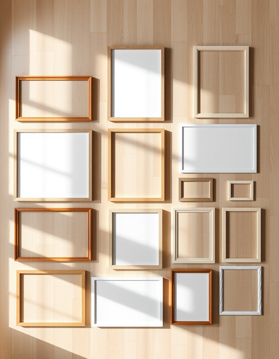
Gallery wall ideas: layouts, frame sourcing, and renter-safe hanging
Affiliate Disclosure: DecorDesignIdeas.com is a participant in the Amazon Services LLC Associates Program, an affiliate advertising program designed to provide a means for sites to earn advertising fees by advertising and linking to Amazon.com.
As an Amazon Associate, we earn from qualifying purchases. This comes at no extra cost to you.
A gallery wall is the fastest way to make a blank wall look deliberate. It is also one of the fastest ways to make a wall look chaotic — the difference between the two is almost entirely planning. This guide walks the layouts that reliably work, where to source frames at every budget, and how to hang everything without losing a security deposit.
This is a research-based guide assembled from design fundamentals and retailer catalog patterns, not a staged showroom portfolio. Where we mention price bands, treat them as planning ranges — check current listings before you buy.
Why gallery walls work (the one paragraph of theory)
A wall of coordinated frames reads as a single large composition instead of many small objects. That gives a room a focal point, absorbs visual noise, and lets cheap art look intentional because the arrangement carries the design weight. The inverse is also true: an unplanned cluster of mismatched frames at random heights reads as clutter, which is why the layout sections below come before anything about buying.
Pick the layout before you buy a single frame
The three layouts that survive contact with real walls:
The grid. Same-size frames, equal spacing, aligned rows and columns. The safest choice — it works in modern, minimalist, and traditional rooms, and it forgives mediocre art because the structure is the star. Best for: hallways, stair landings, behind sofas where you want calm. The main cost is precision: spacing needs to be consistent (more on the paper-template trick below).
The salon wall. Mixed sizes, mixed frame styles, centered on a middle axis that expands outward. This is the classic look — dense, personal, a little bohemian. It works with collections built over years: thrifted frames, kids’ art, prints from trips. The risk is drift — without a defined center line and outer boundary, a salon wall becomes a pile. Best for: living rooms, dining rooms, anyone with an existing frame collection.
The ledge. Frames leaned on a floating shelf or picture ledge instead of hung. The renter’s champion — no wall holes beyond the shelf’s two anchors, and you can swap art in seconds. Best for: rentals, stairwells (one ledge every few feet instead of math), people who rearrange often. Our renter-friendly guide covers the full damage-free toolkit if a ledge still feels like too much commitment.
A fourth structure worth knowing: picture frame molding — trim applied to the wall forming one large rectangle, with art inside. It reads as architectural rather than decorated, and it’s become the upscale variant of the gallery wall. It’s more work (trim, mitered corners, paint matching) and semi-permanent, so treat it as the homeowner’s version of this whole guide.
Frame sourcing by budget tier
Tier 1 — box-store sets (~$2–5 per frame at the low end). Basic 8×10 and 5×7 sets from big-box retailers and IKEA-class stores. Consistent profiles, usually black or basic wood tones. The honest play: buy two or three identical sets and use all of them — a grid of nine identical black frames looks more expensive than nine random “nice” ones. Sets sometimes have shallow profiles that limit matting; check depth if you plan to mat.
Tier 2 — the mix-and-match middle (~$10–30 per frame). This is where personality starts: varied widths, a wood tone or two, maybe one metal frame as an accent. The trick that keeps it cohesive: hold one constant — same color family, same general weight — and vary only one dimension. If everything is black but widths differ, it reads curated. If colors, widths, and styles all differ, it reads yard sale.
Tier 3 — vintage and thrifted (wildly variable). Flea-market and thrift frames are the soul of a good salon wall — solid wood, odd sizes, character. Costs: hunting time, and usually replacing the art inside (the frame is the find; the faded landscape print is not). Check glass condition and hanging hardware — older frames often need new sawtooth hangers or wire, which any hardware store stocks for a couple of dollars.
One consistent rule across tiers: mats make small art look expensive. A 5×7 print in an 11×14 mat and frame reads as a deliberate piece. Matting a set of small prints uniformly is the cheapest upgrade in this entire guide.
What to put in the frames
The arrangement matters more than the art, but the art still matters. Reliable fillers that stay in budget:
- Printable art — enormous online ecosystems sell printable sets at a few dollars each; you print locally at any size the frame needs. The most flexible option for a grid.
- Personal photos, edited uniformly — convert a batch to black-and-white and they instantly coordinate regardless of when or where they were taken. Color photos only stay cohesive if the palettes happen to match.
- Textile and paper fragments — a vintage scarf, seed-catalog pages, sheet music, wallpaper scraps behind glass. Zero-cost salon-wall fuel.
- Kids’ art, curated — a rotating frame or two in the grid, not the whole wall. Keeps it intentional.
Avoid the default trap: buying a pre-matched “wall art set” of five canvases designed to be hung in a row. It fills a wall, but it reads as filler — the off-the-shelf sameness is exactly what a gallery wall is meant to avoid.
The hanging method that prevents 90% of mistakes
Paper templates: trace each frame onto kraft paper or newspaper, cut out, and tape the templates to the wall with painter’s tape. Rearrange until it looks right — this costs minutes — then nail through the paper (or mark, remove, nail). This one habit separates gallery walls that look designed from ones that look attempted.
Height rule of thumb: center the arrangement at roughly eye level, about 57–60 inches to the middle of the grouping, and relate it to the furniture — art clusters over a sofa should start 8–10 inches above the back, not float at the ceiling. For grids, keep spacing consistent: 2–3 inches between frames is the common sweet spot; beyond 4 the grid starts to dissolve into separate pictures.
Anchor heavy frames into studs or use appropriate wall anchors; a large framed piece with real glass can exceed what a bare nail holds. Drywall anchors are rated by weight on the package — match the rating with margin.
Renter-safe hanging that actually works
If the lease says no holes — or you just want the deposit back:
- Picture ledges (two anchors, easily patched) carry a dozen frames with only two wall holes
- Rail systems — a single mounted track with hanging wires, designed exactly for this; standard in European rentals
- Adhesive strips rated for frames (check the weight rating honestly — most are rated for unframed posters and lightweight frames only; a matted glass frame usually exceeds them)
- Lean, don’t hang — a floor-leaning cluster against the wall works at scale with larger frames and zero holes
Our renter-friendly decor guide covers the full damage-free toolkit; move-out patching for the two-anchor ledge route is a dab of spackle and a paint pen.
Room-by-room quick calls
Living room: salon or grid over the sofa; anchor the arrangement width to the sofa (roughly two-thirds to three-quarters of its width), not the wall.
Hallway: grids shine in narrow spaces — a two-column runner of identical frames leads the eye down the corridor.
Stairwell: the diagonal salon — frames stepping up parallel to the stair line, spaced evenly along the rise. Template-paper first; stair walls punish guesswork.
Bedroom: lower-stakes and personal — family photos, softer tones, often best as a small ledge or a modest grid above the bed’s headboard. Our pink bedroom and aesthetic bedroom guides show styling around statement walls.
Entryway: the first-impression wall. One strong ledge or a tight grid of six makes the statement without crowding a small space.
Frequently asked questions
How many frames do I need? A grid reads complete at six to nine. A salon wall needs roughly a dozen mixed pieces to feel abundant. Below those counts, one large statement piece usually beats a sparse cluster — our statement-furniture guide applies the same logic to decor.
Should frames match exactly? They should share a constant — same color, same style family, or same mat treatment — and can vary in everything else. All-matching is calmest (grid); one varied dimension is curated (salon); no constant is clutter.
What size should the wall arrangement be? Cover roughly two-thirds to three-quarters of the wall’s width when there’s furniture below; on a bare wall, leave generous margins on all sides rather than stretching edge-to-edge.
Is picture frame molding worth it? If you own and want an architectural look — yes, it’s the most “designed” version of this entire concept. Renters should stick with ledges and rails; molding is semi-permanent.
How do I light a gallery wall? Picture lights or an adjustable ceiling spot wash the whole arrangement evenly — our living room lighting guide covers layering accent light exactly like this.
The takeaway
Pick the layout first, source frames in one constant-plus-variants logic, fill with art that’s personal and uniformly treated, template everything in paper before touching a nail, and hang at human height. The wall that results looks curated because the process was — and every rule here bends if the result is a wall you love looking at.