Modern living room ideas that look current without chasing trends
Affiliate Disclosure: DecorDesignIdeas.com is a participant in the Amazon Services LLC Associates Program, an affiliate advertising program designed to provide a means for sites to earn advertising fees by advertising and linking to Amazon.com.
As an Amazon Associate, we earn from qualifying purchases. This comes at no extra cost to you.
“Modern” is the most misused word in decorating. It does not mean whatever stores are pushing this season — it means a specific set of choices: low horizontal furniture, restrained color, materials doing the decorating instead of ornament, and light treated as a design element rather than a ceiling fixture. A room built on those ideas reads current for a decade. A room built on this year’s print reads current for eighteen months.
DecorDesignIdeas Editorial writes from manufacturer finish and dimension specs, museum and shelter-photo studies, and the same design references used across our guides. We do not stage rooms, and a trend roundup is not a design plan — every idea below includes what it costs to get wrong.
The small-room version of this page is small living room decorating ideas; TV placement lives in small living room layout with TV; walls are covered in gallery wall layout ideas and accent wall ideas, and the low-budget lane in budget wall decor ideas. Lighting gets its own deep dive in living room lighting ideas.
Layout ideas
1. Float the seating off the walls. The single most modern move available, and it costs nothing. A sofa standing 8-12 inches into the room with a walkway behind it creates depth that wall-hugging furniture cannot. The trade: you need roughly 30 inches of clear walkway, so rooms under 11 feet wide may not have it to give.
2. One low anchor, not a matched set. A low-profile sofa (seat height 17-19 inches) with an unmatched chair beats a matching sofa-loveseat set. Mixed seating has replaced suites in every shelter-magazine living room for years now; the suite is the tell of a showroom default. Budget side: a slipcovered sofa and one good used chair. Splurge side: a true low-frame design piece.
3. Define zones with rugs, not walls. An open plan reads modern when each zone owns its rug. The rug rules that matter: front sofa legs on the rug, rug edges parallel to the wall’s dominant line, and a rug too small for the zone is worse than no rug.
4. Cut the visible clutter by half. Modern rooms photograph calm because they store 80% of what happens in them. A wall of closed storage (a low media console plus a tall closed cabinet in the same finish) reads far more current than open shelving displaying everything.
Color ideas
5. Three colors, one of them white. The modern palette formula most designers actually use: one white (walls or large furniture), one anchor color (the sofa or rug), one accent (pillows, art, a chair) — then wood tones and metal live in between. More colors than that and the room trends toward “eclectic,” which is a different, valid, older look.
6. Warm the neutrals on purpose. The gray-everything era is the recent past; the present is warm neutrals — bone, greige, clay, olive. If your large pieces are cool gray, the honest update is warm-toned textiles and wood, not replacing everything. What dates fastest: high-contrast gray-and-only-gray schemes.
7. One saturated moment, max. A single saturated element — one painted accent wall, one deep-toned chair, one strong rug — keeps a neutral room from washing out. Two saturated elements start competing; three make a different style entirely.
Lighting ideas
8. Kill the overhead as the only source. The layered approach — ambient plus task plus accent — is the defining modern lighting structure. Practical order: a floor lamp beside the seating, a table lamp at the other end, then consider what the ceiling actually needs.
9. One sculptural fixture, if any. Where a statement pendant or arc floor lamp works, it becomes the room’s jewelry and earns its cost. Where it doesn’t (low ceilings, busy sightlines), it is expensive noise. The test: does the fixture read as sculpture when the lights are off?
10. Hide the bias lighting behind the TV. A LED bias strip behind the screen reduces eye strain and reads intentional rather than gadgety — the rare tech that belongs in a modern room. Details in the TV wall guide.
Texture and material ideas
11. Three textures minimum per seating area. Smooth (leather, lacquer), soft (wool, boucle, linen), hard (stone, glass, metal). A neutral room works when texture carries the interest the color gave up. The budget version is entirely textile: a chunky throw, a nubby pillow, a flatweave rug on a jute base.
12. Let wood read as wood. Light oak and walnut dominate modern rooms because visible grain is texture with zero effort. The painted-everything look flattens a room; one substantial wood piece — coffee table, credenza, floating shelf — restores it.
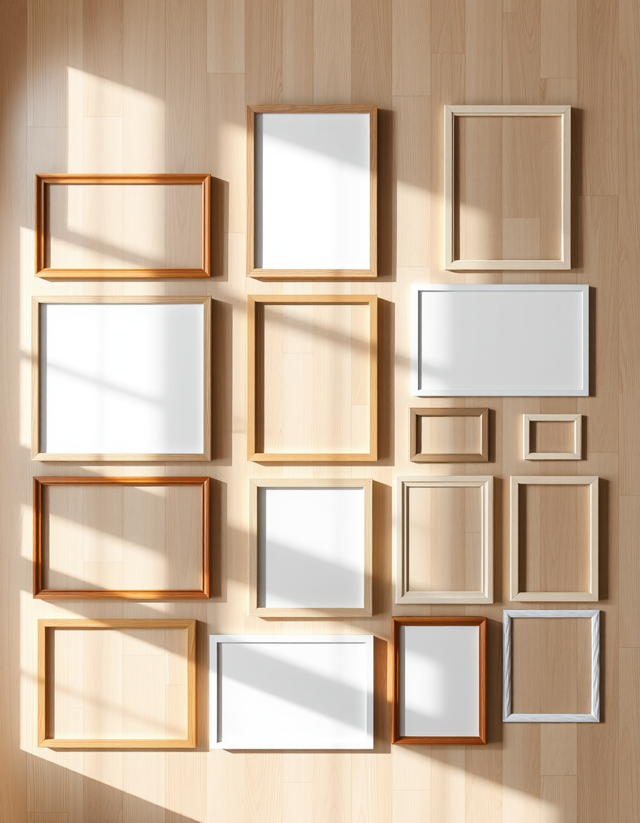
13. Big art beats a grid of small art. One oversized piece (or a tight two) reads modern; a salon wall of many small frames reads traditional — a gallery wall is its own skill and its own look. If budget rules, one large frame with a mat around a modest print reads bigger than it costs.
14. Plants with architecture, not fuss. A single sculptural plant (fiddle leaf, olive tree, large snake plant) in a plain planter does more than a shelf of small pots. The low-light plant guide covers which survive where yours will live.
Before you buy anything
Measure the room and draw the seating zone to scale — most “modern” failures are proportion failures, not style failures. Photograph the room and look at the photo rather than the room; the camera flattens exactly the clutter and imbalance the style punishes. Then change one thing at a time: the modern look is cumulative, and the room should never be gutted in a single weekend.
Desk note: prices for every category above span from thrift-store and big-box to design-retail; the idea list is deliberately product-free so it ages past any season’s lineup.
When to skip an idea
| Idea | Skip it when |
|---|---|
| Floating sofa | Room under ~11 ft wide or a main walkway gets pinched |
| Sculptural fixture | Ceilings under 8 ft or sightlines already busy |
| Oversized art | Wall width under ~5 ft for the piece considered |
| Saturated accent wall | Room already has two+ strong colors |
| Low-profile seating | Household includes members who struggle with low seats |
Bottom Line
Modern is a set of structural choices — low furniture, few colors, real materials, layered light, stored clutter — not a shopping list. Build those and the room stays current through trend cycles; skip them and no purchase fixes it. The budget path through every idea above exists and is usually the better-dressed one.
FAQ
What makes a living room look modern fast, on a small budget? Declutter half, float the sofa, warm the textiles, and add two light sources at seating height. All four are free-to-cheap and do most of the visual work.
Is gray still modern? As an all-over scheme, no — it reads as the late-2010s default. As one cool tone within a warm-neutral palette, it’s fine.
How often should a ‘modern’ room be updated? Structural choices hold a decade; textiles and paint refresh in an afternoon. If a room needs replacement rather than refresh, the trend was bought too literally the first time.
Related Guides
- Small living room decorating ideas
- Gallery wall layout ideas
- Budget wall decor ideas
- Living room lighting ideas
Sources
- Furniture dimension conventions: manufacturer spec pages (West Elm, Article, IKEA seating heights)
- Lighting layering: IES residential guidance as cited in our lighting guide
- Color trend documentation: shelter-magazine archive reviews (Architectural Digest, Dwell living-room features)